The People’s Convoy
Contents
As a proud American and patriot, I am saddened, disgusted, and angered by what has been happening in our great nation. The lies, deceit, corruption, dishonesty, and hatred of the cheating left are pushing the American People to their breaking point. Our founding fathers would be beyond disappointed at the state of the nation they established nearly a quarter of a millennium ago.
A pushback from the People is inevitable, and I was amazed to see that this movement has started with our Canadian brothers and sisters. Unfair and totally unconstitutional mandates and draconian measures must be stopped to prevent further encroachment upon our freedoms, and I applaud our American truckers who will protest in the American freedom convoy to Washington, D.C.
Now, what the American People’s freedom convoy movement needs is a voice, and this voice begins with what I am proposing here.
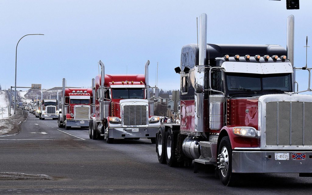
The Canadian freedom convoy rolls through the snow-driven landscape to Ottawa.
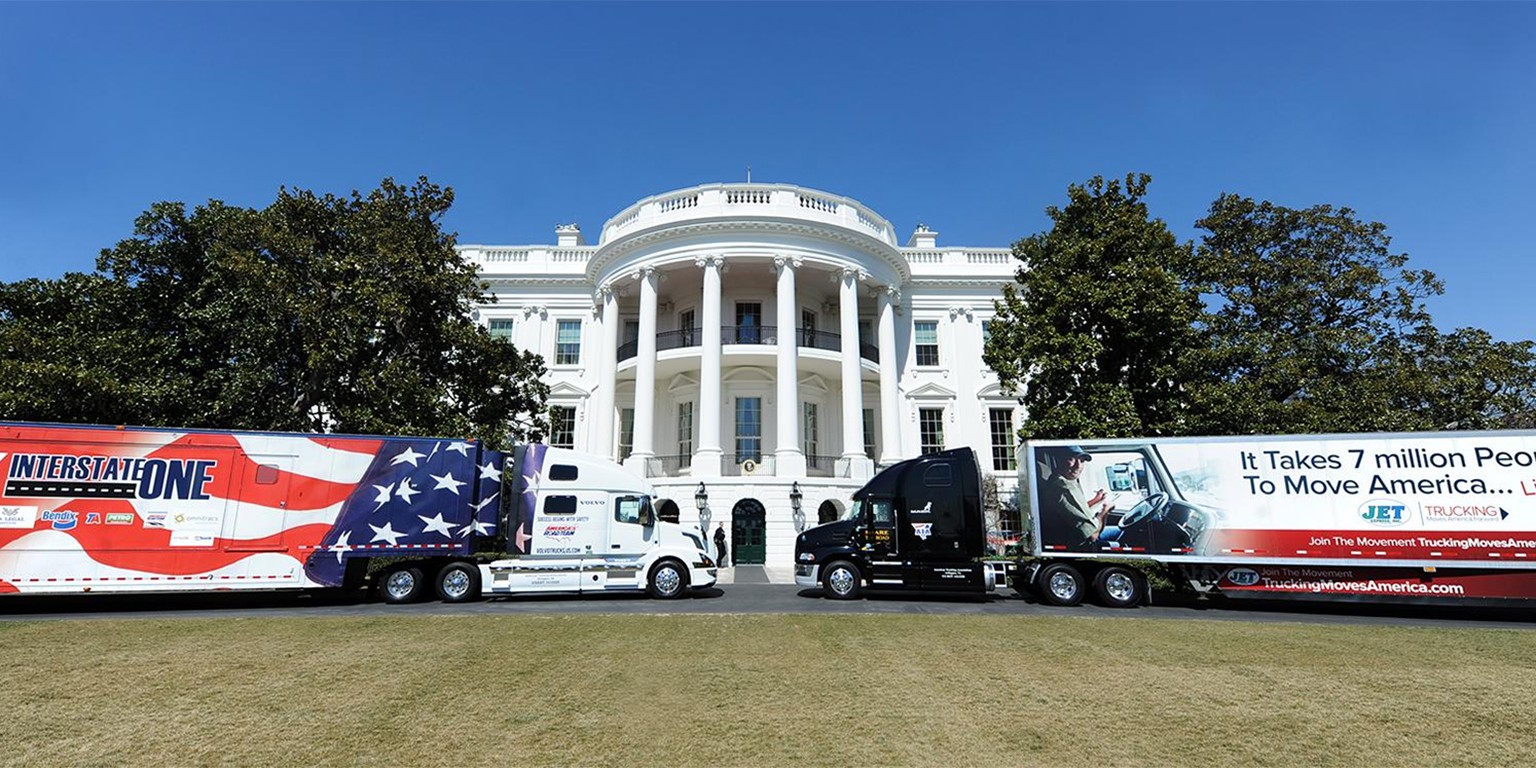
Once upon a time, President Trump proudly invited truckers to the White House.
Any kind of entity, be it a Fortune 500 corporation or a grassroots movement, benefits from the field of graphic design. Professionals in this field are masters in the art of visual communication. Their years of formal education and experience have facilitated a lifelong understanding of the need for a strong, conceptual meaning behind all design aspects. Everything from an entity’s logo to its printed and online publications must convey a consistent and compelling message. Aside from the mastery of concept formulation, what also distinguishes genius from mediocrity is the designer’s talented eye for refinement of execution and detail.
As a proud American and patriot who is also a graphic designer, I decided to be proactive by exploring and conceptualizing what a logo would look like for your movement. I knew that it needed to evoke a truly American design style but, at the same time, encapsulate an aesthetic that promotes our time-honored American traditions and ideals through our pride, patriotism, and freedom.
I decided to go back to our nation’s beginning. It was July 1776, and our founding fathers had just penned our Declaration of Independence from the tyranny of Great Britain. The American People needed to be made aware of this declaration. Benjamin Franklin was a printer, and he took this first document and translated it into a printed document on his printing press. The metal types that he used on his press were originally cast in England by the typefounder William Caslon I, whose types were in fashion for most of the 18th century, and it was common practice at the time that all colonies of the British Empire would utilize English-designed typefaces. To make an incredibly long story short, Benjamin Franklin then printed a number of broadsides in Caslon types, and these broadsides were posted in public areas so the American People could read our Declaration of Independence. Upon learning of the role that Caslon types played in the establishment of our nation, I knew that I had found my typeface choice for your movement’s logo.
The typefaces you are reading here are Caslon 540 Roman and Italic, which were revivals based on William Caslon’s original designs — which were used by Benjamin Franklin on his press — and cast by American Type Founders in 1900. Also, the red section headlines are set in Caslon 437 Roman, which was optimized and cut in larger point sizes for headline and display usage.
However, because Caslon 540 is optimized for long passages of text, I knew it would lack finesse in a logo. Caslon 437, with its delicate hairlines, would lack the punch needed to make a strong statement and be too faint when the logo is scaled to a smaller size. New York-born type designer Ed Benguiat (1927–2020) designed a number of Caslon typeface variations during his illustrious career, and his Caslon types are among the best for display usage, as well as for branding purposes.
One last thing that must be considered in a logo is the name of the entity. I realize that your movement’s name recently changed from “March for Freedom Convoy to DC 2022” to simply “The People’s Convoy.” I understand that the purpose of your Facebook page is to promote all freedom convoys here and elsewhere, but our own American freedom convoy needs to be recognized as its own entity. Plus, it will give the American People hope and enthusiasm for your cause, and it will facilitate inspiration in something they can instantly relate to and support. Calling your own convoy simply “The People’s Convoy” is a bit too concise and generic. Your actual freedom convoy event to Washington, D.C., should capitalize on the fact that it is unapologetically “The American People’s Freedom Convoy.”
Firstly for your consideration, I will showcase my proposed logotype variations for “The People’s Convoy,” any of which can be used on your Facebook page. The layout of Variation 1A is all center-aligned, and Variation 2A has “The” left-aligned and “Convoy” right-aligned. Variation 3A shows how “The People’s Freedom Convoy” would look if the name changed accordingly. In all of these variations, the red word is set in all capitals in Benguiat Caslon (1966), and the blue words are set in ITC Caslon No. 224 Bold Italic (1982), which was based on Caslon No. 223 (1969) designed by Tom Carnase prior to the founding of ITC (more formally known as International Typeface Corporation). Considerable modifications have been made to certain letters in each of these variations, which adds a factor of uniqueness and customization so that one simply cannot recreate these logotypes by merely typing these words in the respective fonts. This point of differentiation is what makes these logotypes unique, professionally designed, and full of patriotic character.

Proposed logotype variation (1A) shown at 720 pixels wide for detail.
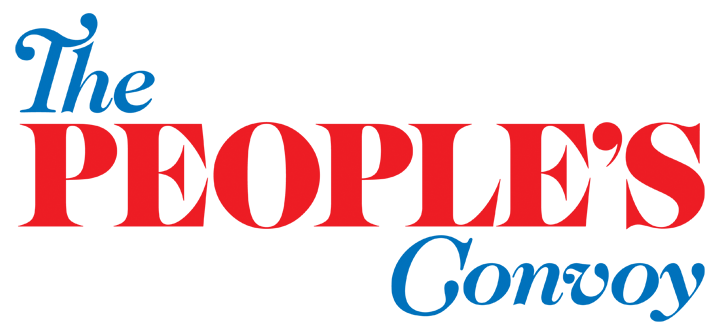
Proposed logotype variation (2A) shown at 720 pixels wide for detail.
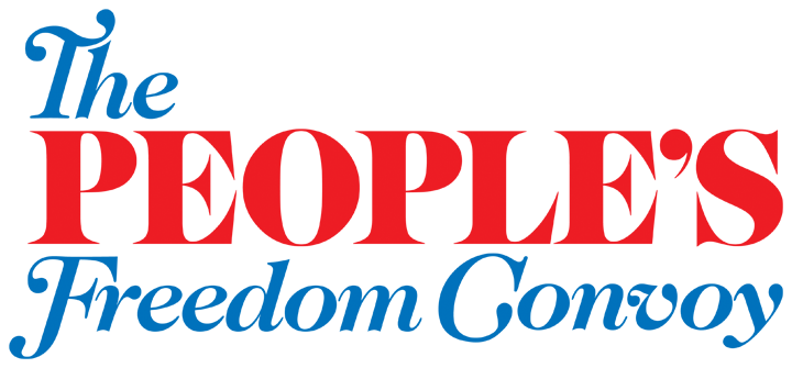
Proposed logotype variation (3A) shown at 720 pixels wide for detail.
The following (B) variations differ in one small design detail from the above (A) variations, and it has nothing to do with the (B) variations being somehow inferior to the (A) variations. The difference is the substitution of a swash capital “S” in the word “People’s,” and this relates to my proposed logotypes for the American freedom convoy event to Washington, D.C. As you will see, these (B) variations exhibit more design cohesion with my overall proposal, but the (A) variations with their plain “S” still present a sober alternative to the proposed branding.
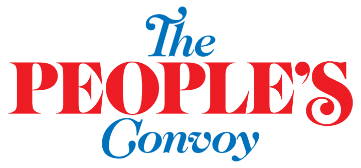
Proposed logotype variation (1B) shown at 720 pixels wide for detail.
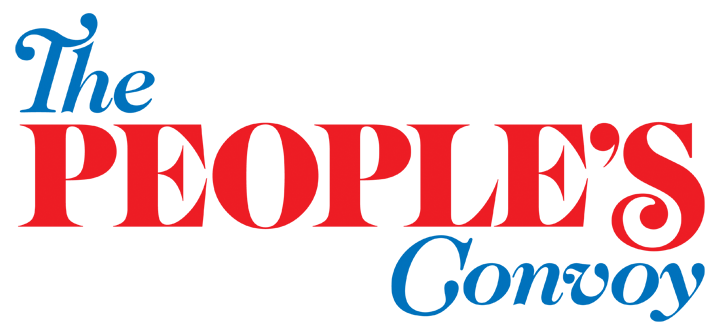
Proposed logotype variation (2B) shown at 720 pixels wide for detail.
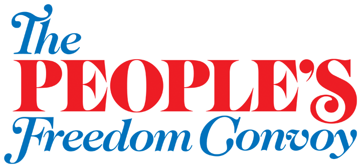
Proposed logotype variation (3B) shown at 720 pixels wide for detail.
The following (C) variations are the same as the above (A) variations with the addition of the patriotic stars. These (C) variations use the plain capital “S” in the word “People’s” for a sober alternative to the proposed branding.
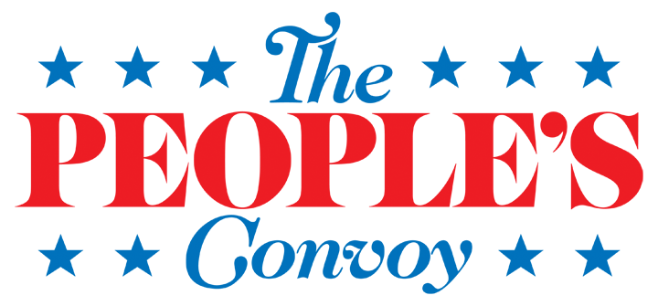
Proposed logotype variation (1C) shown at 720 pixels wide for detail.
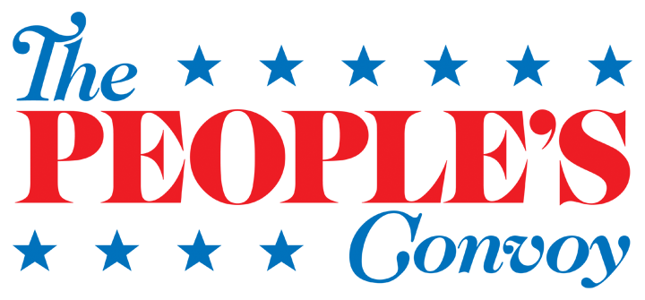
Proposed logotype variation (2C) shown at 720 pixels wide for detail.
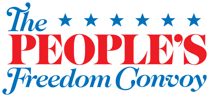
Proposed logotype variation (3C) shown at 720 pixels wide for detail.
The following (D) variations, with the addition of the patriotic stars, are the same as the above (B) variations with the swash capital “S” in the word “People’s” for that added pizzazz and sparkle to the proposed branding.
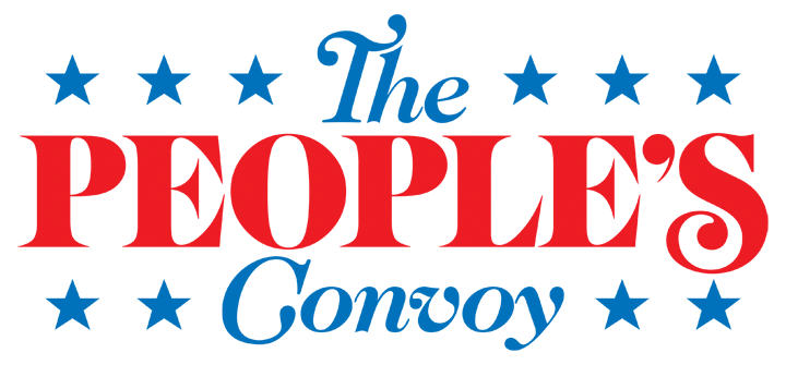
Proposed logotype variation (1D) shown at 720 pixels wide for detail.
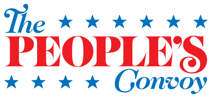
Proposed logotype variation (2D) shown at 720 pixels wide for detail.
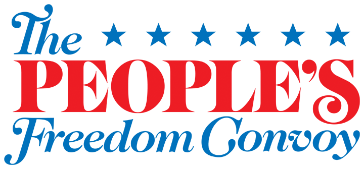
Proposed logotype variation (3D) shown at 720 pixels wide for detail.
It is important for any logomark or logotype to work at any size. No part of its design should be sacrificed when scaled down accordingly. A logotype should still be legible and instantly recognized. As illustrated below, each of the proposed logotypes have been scaled down to 180 pixels wide to exhibit their functionality and legibility at a small size, if used as a header or footer logo for example.


Proposed logotype variations (1A, 2A, 3A)
shown at 180 pixels wide.


Proposed logotype variations (1C, 2C, 3C)
shown at 180 pixels wide.


Proposed logotype variations (1B, 2B, 3B)
shown at 180 pixels wide.


Proposed logotype variations (1D, 2D, 3D)
shown at 180 pixels wide.
Building on the solid conceptual foundation and design execution of the above proposed logotypes for “The People’s Convoy,” the following proposed logotype in this section is for “The American People’s Freedom Convoy” event from California to Washington, D.C. This proposed event logotype is only one basic design, and it is a natural design progession and evolution from the same conceptual foundation exhibited thus far. I have displayed the proposed logotype in three sizes to show how its legibility and functionality are effective regardless of its scaled optical size.
I also show how this logotype can be used on light and dark backgrounds. Think of the black text variation as the primary variation. The white text variation expands its capability to be used over dark-colored or photographic backgrounds.
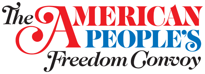
Proposed event logotype shown at 720 pixels wide for detail.
The same proposed event logotype shown at 360 pixels wide.

The same proposed event logotype shown at 180 pixels wide.
Proposed event logotype shown with reversed-color text at 720 pixels wide for detail.

The same proposed event logotype shown at 360 pixels wide.

The same proposed event logotype shown at 180 pixels wide.
So far, I have shown how a solid concept can form the foundation for variations on the same theme. Each of the above proposed logotypes exhibit the same proud vision and patriotic flavor of your freedom movement.
So, what more can be done to promote this strong concept? How about a dedicated logomark for “The American People’s Freedom Convoy” event?
A logomark is one that incorporates a logotype with some sort of image, be it an icon, illustration, or some other drawn element. Here, I take the name of the event (the actual freedom convoy from California to Washington, D.C.) and illustrate what it is about. Drawing upon inspiration from the Canadian freedom convoy to Ottawa, I chose to show a convoy of only three trucks, but with its vanishing point somewhere in the distant horizon, one gets the feeling that these three trucks are leading a long line of trucks across America to their final destination. I then rendered this convoy illustration as a simple duotone of the patriotic blue color already in use for the logotype. To bring visual interest to the logotype and to avoid an unsightly overlap with the lead truck, I warped part of the logotype with an upward curvature. I then added some patriotic elements like the American flags and the American eagle on the side of each container; also of note, the “We the People” text is the same exact lettering that appears on our nation’s Constitution. The resulting logomark continues to build upon the same conceptual foundation and design execution as the above logotypes. I have displayed the proposed convoy event logomark in two sizes to show how its legibility and functionality do not diminish at a smaller optical size.
I also show how this event logomark can be used on light and dark backgrounds. As with the above proposed event logotype, think of the black outline variation as the primary variation, and the white outline variation expands its capability for use over dark-colored backgrounds. Either variation can be used over photographic backgrounds, depending on the photo itself.
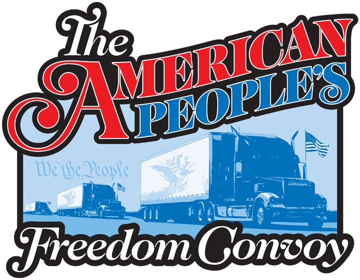
Proposed event logomark shown at 720 pixels wide for detail.
The same proposed event logomark shown at 360 pixels wide.
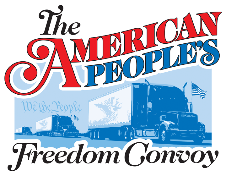
Proposed event logomark shown with reversed-color text and outline at 720 pixels wide for detail.
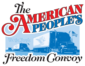
The same proposed event logomark shown at 360 pixels wide.
Another variation to the proposed logotypes involves applying Photoshop filters to produce a glossy, metallic appearance. The resulting variations below could be utilized for online use like on your website or Facebook page, but it would not be advisable to use these variations on t-shirts. The silkscreen process requires solid colors that can be easily separated, and the intricate gradients and highlights would not screen properly onto fabric. Nonetheless, these glossy variations would provide visual interest when viewed in the context as online artwork for your website, and they can work on both light and dark backgrounds.
Proposed logotype variation (2B) with glossy appearance shown at 720 pixels wide for detail.
Proposed logotype variation (1C) with glossy appearance shown at 720 pixels wide for detail.
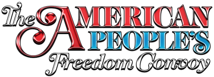
Proposed event logomark with glossy appearance shown at 720 pixels wide for detail.

Proposed logotype variation (2B) with glossy appearance shown at 720 pixels wide for detail.

Proposed logotype variation (1C) with glossy appearance shown at 720 pixels wide for detail.

Proposed event logomark with glossy appearance shown at 720 pixels wide for detail.

Proposed logotype variation (2B) with glossy appearance shown at 720 pixels wide for detail.

Proposed logotype variation (1C) with glossy appearance shown at 720 pixels wide for detail.

Proposed event logomark with glossy appearance shown at 720 pixels wide for detail.
So far, the voice of your freedom movement has come from the branding and identity conveyed through the proposed logotypes and logomarks. The next step in building your voice is through promotion, and logos aid in this step.
As a real-world example of what could happen, let us suppose that Facebook decides to shut down your page. What can be done? You could decide to purchase and register a domain (e.g., www.peoplesconvoy.com or something similar), and as long as you have a domain host provider that believes in the First Amendment, you could run your own website for your movement. Instead of being at the mercy of a liberal media platform like Facebook, your website will serve as the online home for your freedom movement, and it will give credibility to your cause. You can still have a Facebook page to attract people, but your Facebook followers can be routed to your website for all news updates. You can operate your own website without fear of being cancelled or falsely accused of using inciteful hate speech. Plus, if your website employs Wordpress like this website you are viewing, you can have a blog through which news updates can be posted. A Wordpress-enabled website can still connect to other social media platforms, and you can have more freedom to post and say whatever you want on your website, which is branded with your professionally designed logos.
Also, your website can even be used to track your freedom convoy event’s progress as it reaches its final destination. (A map of your route could be drawn and posted on your website. As a sample of my handiwork, see the map below that I drew for a Mustang club’s cruise route.) Your website can even be used to collect and tally all monetary donations made through the website. Of course, I would imagine that your freedom movement would need to be established as a nonprofit organization to keep things legal and financially sound with the IRS. There are numerous ways that your website can be put to good use for your cause, and these are only a few.
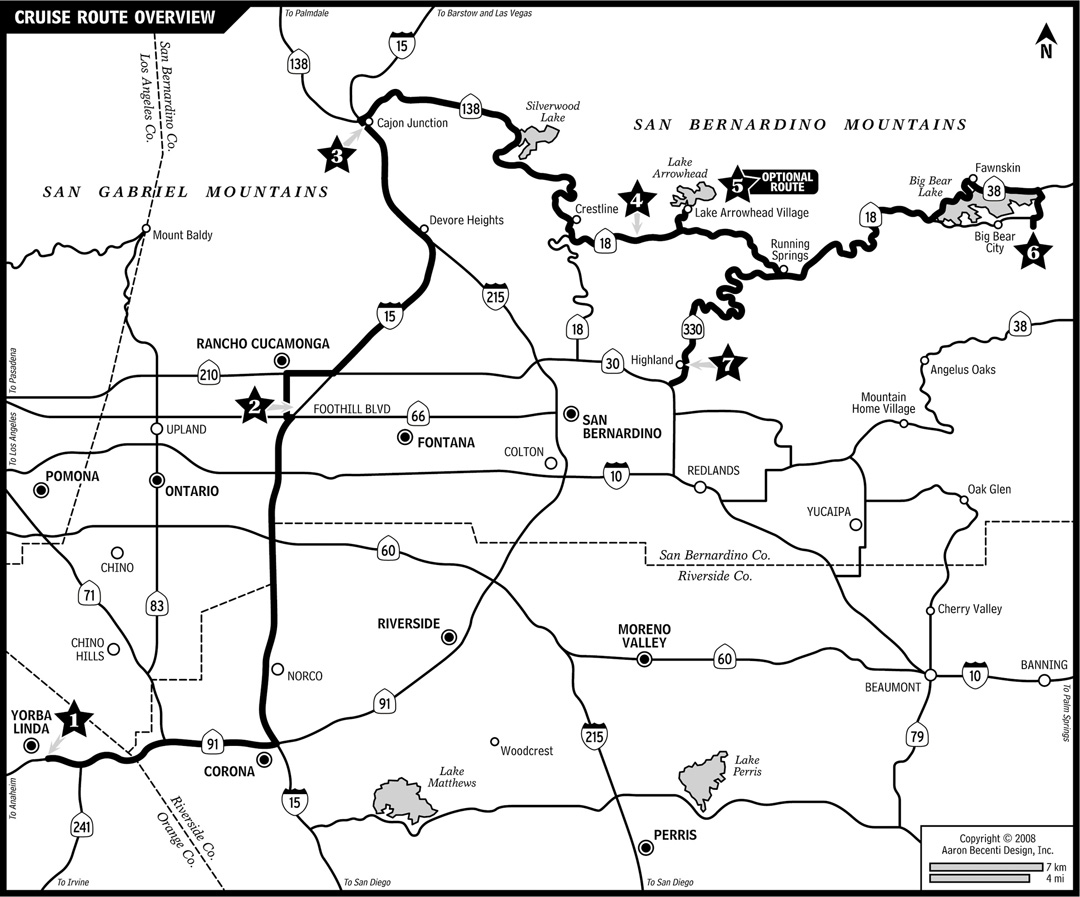
A road map drawn to scale for a local Mustang club’s cruise route in 2008.
Another way to promote your voice is through merchandise branded with your movement’s logo. An easy, no-brainer example is event t-shirts. The American People who are interested in protecting their freedom are already onboard with your cause, and your movement could easily capitalize on their willing support (and raise much-needed funds) by selling t-shirts for the American freedom convoy event to Washington, D.C., which I strongly believe the American People would enthusiastically purchase (especially after being informed of their availability on your next appearance on a Fox News show).
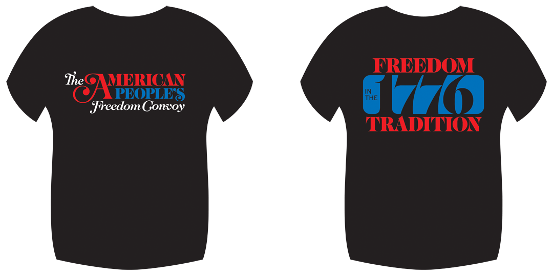
The t-shirt mock-ups below illustrate how “The American People’s Freedom Convoy” event logotype and logomark can be used. The mock-ups show how the design differs between white and black t-shirts. Once your convoy route has been finalized, on the back of the t-shirt, “L.A. to D.C. 2022” (with “to” stylized as a highway-sign arrow) can be placed under the logomark. Also, I assumed that Los Angeles would be the starting point for your convoy only because The Port of Los Angeles is known as “America’s Port” and is our nation’s #1 container port.
Proposed convoy event t-shirt mock-up in white, showing front (left) and back (right) designs.

Proposed convoy event t-shirt mock-up in black, showing front (left) and back (right) designs.
The above t-shirt mock-ups introduce a secondary typeface that could be utilized in printed publications for your movement. The “L.A. to D.C. 2022” line of text is set in the heavier black weight of the Interstate typeface family. Based on the actual typeface employed by the U.S. government for all highway signage made since the 1950s, the Interstate family adds an industrial, working-class feel by giving a respectful nod to the transport industry that keeps America running.
For online publications like your website, licensing the Interstate family may be a bit costly. However, there is a free, open-source version called Overpass that could be utilized. The Overpass typeface family still has the same industrial flavor as Interstate, and it has the added bonus of an SIL Open Font License. Plus, either typeface family would complement the Caslon types used extensively for body text, as well as the display weights used for logotypes and logomarks.
The Overpass typeface family would complement the Caslon types used for body and display text.
Below are some more t-shirt mock-ups that continue to build upon the established conceptual foundation and design execution of the proposed branding thus far for your movement and event, which can potentially have several t-shirt designs that convey the same basic message of freedom. One small note, just for clarification purposes, the last t-shirt mock-up below shows the American flag on the back, and the stripes are made up of “USA!” in repetition, much like our proud battle cry at the Olympics or at Trump rallies: “USA! USA! USA! USA! USA! USA! USA!”
Proposed convoy event t-shirt mock-up in white, showing front (left) and back (right) designs.
Proposed convoy event t-shirt mock-up in black, showing front (left) and back (right) designs.
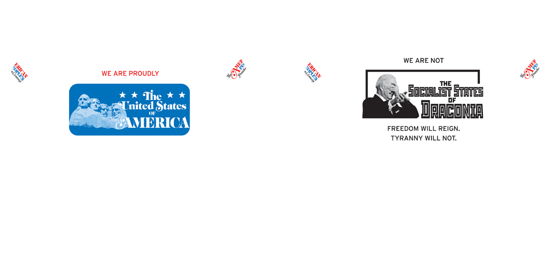
Proposed convoy event t-shirt mock-up in white, showing front (left) and back (right) designs and event logotypes on the sleeves.
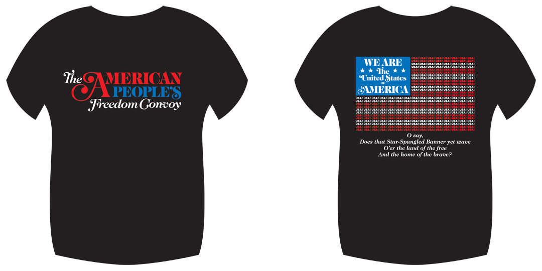
Proposed convoy event t-shirt mock-up in black, showing front (left) and back (right) designs.

The American flag design on the back of the above t-shirt mock-up shown at 1080 pixels wide for detail.
I hope you have enjoyed reading what I had to say and viewing what I had to share. As with any project, I take great pride and care in the work I do. Even for myself, it has been interesting to recount my entire design process, which first started one week ago after hearing Jeremy Johnson and Brian Brase speak on a Fox News show and being inspired by your cause for the American People.
A solid conceptual foundation and superb design execution all contribute to establishing a credible voice for a cause and a movement that will win over the hearts and minds of the American People for the preservation of our freedom, for not only this generation, but for our children and our children’s children. Tyranny and the perverse evil of the left must be stopped, and I hope that, above all else, I can assist by supplying the communicative tools needed to help establish your voice. I completed this work, not for my own ego or benefit, but for my patriotic duty as an American to freely give aid in an area that can utilize my expertise.
If you like what you have seen, feel free to contact me at aaron@mystichrome.com anytime to inquire about my work.
— Aaron Becenti, posted on February 9, 2022
P.S. Just so you know that I am a real human being, below is a photo of myself with my pride and joy — my 2004 Mystichrome Cobra, one of 495 convertibles made by Ford to celebrate the Mustang’s 40th anniversary. I have owned this domain and maintained this website since 2004 as the online home for these rare cars. Please feel free to peruse this website and learn about these amazing vehicles!
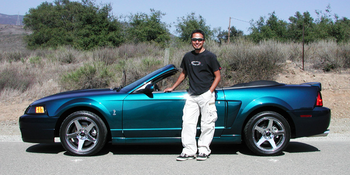
Here I am in 2004 as a recent college graduate with my graduation present to myself, a brand new Mystichrome Cobra convertible.
Eighteen years later, I have aged a bit, but my car still looks the way it did in 2004.
