Orange County Rose Society
Proposal
Branding & Identity Design
Sections of this proposal
Introduction
Any kind of entity, be it a Fortune 500 corporation or a mom-and-pop business, benefits from the field of graphic design. Professionals in this field are masters in the art of visual communication. Their years of formal education and experience have facilitated a lifelong understanding of the need for strong, conceptual meaning behind all aspects of design. Everything from a company’s logo to its printed and online publications must convey a consistent and compelling message. Aside from the mastery of concept formulation, what also distinguishes genius from mediocrity is the designer’s talented eye for refinement of execution and detail.
In March 2021, what began in earnest as a fun exercise in concept formulation and design execution grew into the monumental work that is presented here. One good thing that came of the COVID lockdowns was deep reflection and an appreciation of the past. I came across my old OCRS name badge one day, and I immediately started to reminisce about my time as an active member while I was in graduate school. I began to wonder about all those kind people I had met in the rose society years ago. Then, I began to look at my name badge, and, I mean, I really examined it through my own graphic artist’s eye.
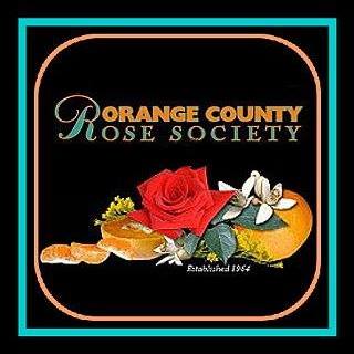
Aside from the OCRS logo’s glaring flaws in design execution (and poor resolution even by web standards), I still completely understood its concept, and it was truly a strong, compelling concept. The logo’s only deficiencies were in how it suffered from poor design choices and judgment.
Firstly, for such a small piece of visual communication, using three dissimilar typefaces to communicate four words is a bit much. One typeface is the norm. Two, only if necessary. The whole point of designing a logotype (the specific or formal name of an entity that has been consolidated as a unique mark) is to bring certain cohesion in design and communication to the name. The arrangement of the three dissimilar typefaces brings an unsightly, disjointed appearance and a mixed message of modernism (“Orange County” in all caps in an Art Deco-era British typeface), formality (the large script capital “R”), and history (“ose Society” in all caps in a 17th-century French typeface).
To my trained graphic designer’s eye, the random placement of strewn orange carpels (yes, that is the correct term for those individually encased segments inside a citrus fruit) makes the whole arrangement look half-eaten, messy, and unbalanced. Overall, any kind of logo for an entity that is supposed to convey something from such a desirable, prominent place as Orange County, California, should have a certain je ne sais quoi, a certain degree of quality or high standard. Furthermore, a logo should never be comprised of clip art or something that was not rendered by the designer’s own hand. That’s just plain laziness and shows a lack of creative thought.
Conceptual discovery and formulation
We are fortunate to live in Southern California, where our winters are relatively mild compared to other parts of the country, and we are very fortunate to live in Orange County, which has its own rich history steeped in farming and agriculture. A century ago, Orange County must have been a sight to behold, with its endless acres of orange groves and fruit stands along every major, dusty thoroughfare. And not just oranges! Other types of citrus, nuts, avocados, strawberries, and beans also grew on various tracts of land throughout the county. However, oranges were the main industry since Sunkist oversaw major orange-growing operations during the county’s early days. Even the name “Orange County” reflects this heritage.
Thus, it only makes sense that the logo for the Orange County Rose Society should reflect its namesake heritage. And then, bingo! That’s the concept of the old logo: HERITAGE! Yes, heritage. The word heritage forced me to realize that there’s another player in this whole scheme that has its own illustrious heritage.
In this current age of throwaway items, if any kind of entity or product lives to see a few years to a decade of useful life, then it’s considered a success. Upon inspecting the old OCRS logo, in very small, pixelated type underneath the rose-and-oranges arrangement were the words: “Established 1964.”
OCRS is 57 years old? So, the Orange County Rose Society was started in 1964. The same year that Ford Motor Company first introduced the Mustang. The same year of The Beatles’ American Invasion, while The Beach Boys and Jan & Dean instilled dreams of the surfing lifestyle and Southern California culture. People were still in shock over JFK’s assassination the previous November, and LBJ was the President who escalated American involvement in Vietnam after the Gulf of Tonkin incident in August 1964. That fall, ghoulish comedy hit primetime in the form of The Addams Family and The Munsters. I’m sure there are a number of other great events and things that either happened or started in 1964, and I felt that OCRS should capitalize on 57 years of heritage … and counting!
And there it was, my idea for a compelling concept behind any design work for the Orange County Rose Society, which I have dubbed “Heritage 1964” as the title for my proposed design philosophy.
As a critically-thinking, formally-educated, professional graphic artist, I took it upon myself to research design styles from 1964. What design trends were the “happening” things in 1964? This was before hippies and the psychedelic styles of the latter half of the decade. Being an avid automotive enthusiast, I have numerous sales brochures for various vehicles dating back to the 1950s. As a starting point, I pulled out these old brochures from the first half of the 1960s and studied everything about them. The colors, layouts, photographs, illustrations, and typography all exuded one thing: CLASS. Opulence and elegance were the keys to successful design from the ’60s. I had never before seen Times New Roman look so elegant. Swashes galore! Lettering with tight kerning (letter spacing) was the norm. There was a certain romantic quality about design from this era, even in the methods that photography was rendered. Thus, my research has led me to believe that an Orange County Rose Society logo designed and executed in the “Heritage 1964” design philosophy should look like my examples presented below.
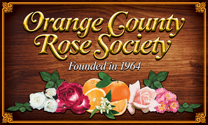
Proposed full logo for Orange County Rose Society, shown at 720 pixels wide for detail.

The same proposed full logo, scaled down to 360 pixels wide.
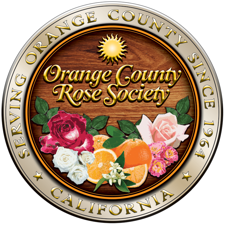
Proposed seal logo (variation #1) for Orange County Rose Society, shown at 720 pixels wide for detail.
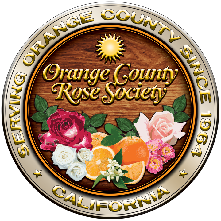
Proposed seal logo (variation #2) for Orange County Rose Society, shown at 720 pixels wide for detail.

The above proposed seal logo (variation #1),
scaled down to 360 pixels wide.
The above proposed seal logo (variation #2),
scaled down to 360 pixels wide.

Proposed logotype (in black) for Orange County Rose Society, shown at 720 pixels wide for detail.

Proposed logotype (colorized in PMS 151) for Orange County Rose Society, shown at 720 pixels wide for detail.

Proposed logotype (colorized in PMS 361) for Orange County Rose Society, shown at 720 pixels wide for detail.
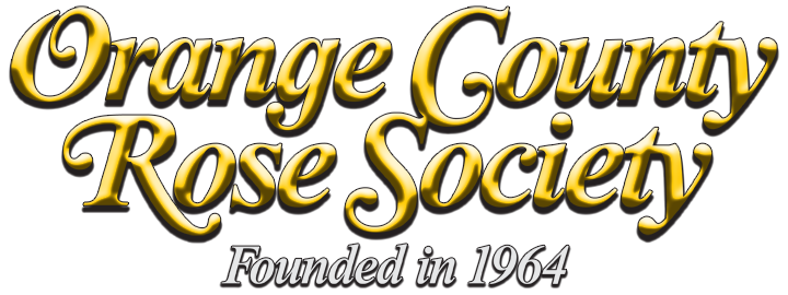
A variation of the proposed logotype (with polished gold/brass effect and drop shadow) with year of inception,
shown at 720 pixels wide for detail.



Analysis of the “Heritage 1964” logo design
Each of the above OCRS logo configurations can be used within the “Heritage 1964” design construct, and each could have specific use. For example, the full logo above (which I jokingly refer to as the “cutting-board” logo) can be used in printed publications where the oranges-and-roses arrangement can be admired in detail, and the seal logo can be used for official documentation or publication. Both of these logo configurations are considered as full logos because they contain the OCRS logotype and imagery which can be trademarked. The standalone OCRS logotype can be used whenever a full logo would be inappropriate or redundant.
One may ask, “why the wood background?” The wood is significant to Orange County’s agricultural history. What are orange trees made of? All those orange groves that once dominated the landscape produced massive quantities of fresh fruit for our growing nation, and what were all those oranges shipped in? Wooden crates! So, yes, wood is an important element in our county’s history.
On the seal logo, the sun has significance because year-round sunshine is a hallmark of Southern California.
The “corporate colors” of OCRS should, again, reflect the “Heritage 1964” concept. It’s only logical that anything with regard to Orange County should be orange and green to signify the colors of those historic orange groves, but choosing the right shades of these colors requires a designer’s trained eye.
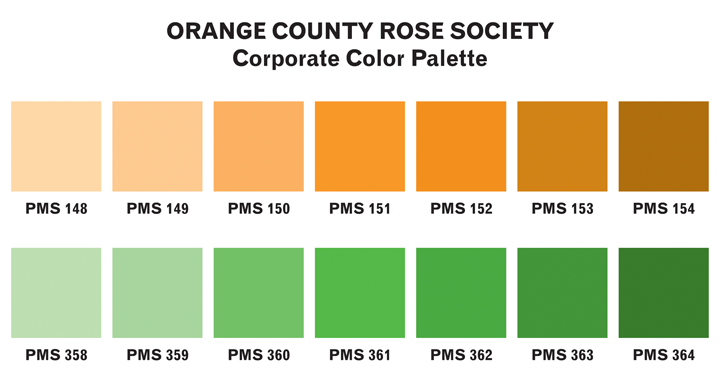
Proposed corporate color palette for Orange County Rose Society.
Orange can be a difficult color to use. So, I chose an orange color that isn’t such a loud, obnoxious, in-your-face, bright orange color. One that has a retro or vintage vibe and is closer to the color of real-life oranges, PMS 151. (By the way, the Pantone Matching System, known simply as “PMS” for short, has been the design standard for color print production since the 1960s.)
For the green, I didn’t want a bright Christmas green, pine green, ivy green, or grass green. It needed to be more in line with the color of citrus leaves, and it needed to echo the same retro/vintage vibe of my chosen orange color. So, I chose PMS 361 for the green color.
Therefore, PMS 151 and PMS 361 can be established as the Orange County Rose Society’s orange and green corporate colors, respectively. Percentages of these colors and derivative colors within their respective spectrums can also be used. For PMS 151, the derivative colors are PMS 148 (a pale sherbet orange) through PMS 154 (a warm chocolate brown), with PMS 151 in the middle of the spectrum. For PMS 361, the derivative colors are PMS 358 (a light melon green) through PMS 364 (a dark forest green), with PMS 361 in the middle of that spectrum. According to the actual printed samples of these colors in my Pantone book, the colors you see here on your screen are more representative than actual because PMS is based on printed inks and not on RGB visual displays.
Saving the best for last (and my personal favorite), typography is the essential, paramount design element that can tie everything together in the execution of anything professionally designed. As human beings with a culture based on written language, most of our visual communication is heavily typographic. Until the day comes when human beings are able to fluently communicate by telepathy, the written word will always take precedence.
As stated earlier, my research of typographic trends from the first half of the 1960s pointed to a pronounced penchant for elegant, opulent letterforms. Maybe considered as garish by today’s minimalist (albeit boring) design trends, the typefaces and their lavish layouts reflected just how swingin’ the ’60s really were! Presented below are just a few examples of the typographic trends of the first half of the 1960s.

The 1960 Dell Books edition of Boswell’s Life of Samuel Johnson made good use of
Caslon 540 Italic Swash (released by American Typefounders in 1902, with swash capitals following in the 1920s),
a typeface that hearkens back to the 18th-century types by the Englishman William Caslon I.
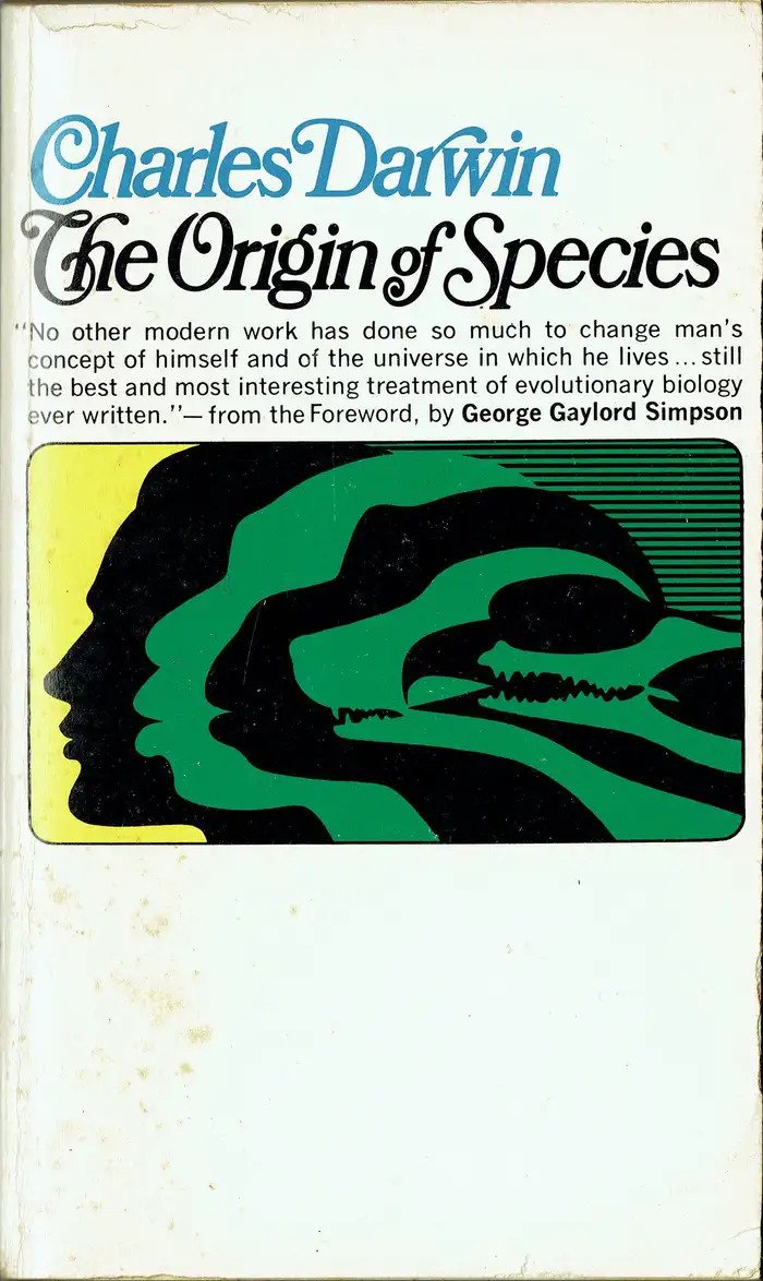
The 1962 Collier Books edition of Darwin’s work utilized a ’60s favorite, Bookman Italic Swash.
First introduced by The Bruce Foundry of New York at the start of the 20th century, swashes were added
just before World War II and into the postwar phototype era.
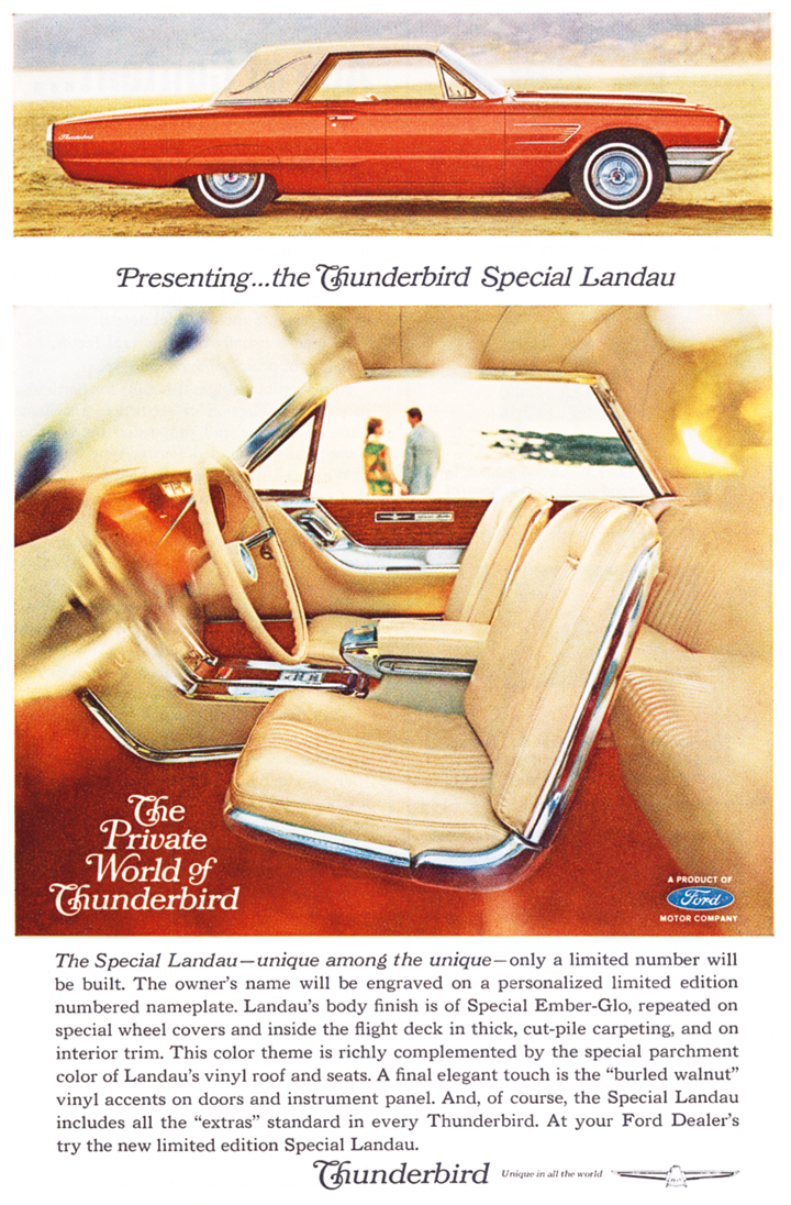
Designed by a Ford Motor Company graphic artist sometime in 1964, Bookman Italic Swash was used extensively
in this magazine advertisement for the flashiest Thunderbird to date, the 1965 Special Landau,
which was Ford’s way of celebrating the marque’s tenth anniversary.
I knew that whatever the chosen typeface for a rose society’s logotype should exude class, elegance, and opulence. As an avid type collector for nearly 30 years, I have amassed a collection of over 40,000 fonts, and I have the same typefaces exhibited in the above typographic examples. So, I started playing around with the Caslon and Bookman types, but when typesetting the OCRS name, neither achieved what I was envisioning, even though either one could have worked well under the “Heritage 1964” design philosophy.
While thumbing through my early-1960s car brochures and automotive magazines, I began to notice the frequency that Times New Roman was utilized as the chosen typeface. (Remember, this was long before personal computers and its eventual, ill-served status of being a mere default font. Times New Roman was originally commissioned by the British newspaper The Times, designed at Monotype in 1931–1932, and made its official debut in the October 3, 1932, edition of The Times, which happens to be 89 years ago. However, Times New Roman remained proprietary for a while, but it gained popularity in the United States starting in the 1950s. To learn more about Times New Roman and its history, read about it on Wikipedia HERE.) I then began to notice the grace and dignity of the typographic treatments given to Times New Roman and its various optical cuts available at the time. Never before had I seen Times New Roman exude such an air of restrained elegance and class!
Then, by chance, I came across a discussion about Times New Roman swash characters on a typography enthusiast website and how graphic artists of the past had tried to add swashes to Times New Roman’s glyphs. Toward the end of the lengthy but informative discussion, someone mentioned that there are now swash characters in the italic fonts of the 2017 release of Opentype versions 6.96 and 7.00 of Times New Roman. Lo and behold, I found that my computer’s Opentype version of Times New Roman was indeed 7.00, and upon inspecting the glyphs palette inside my Opentype-savvy Adobe Creative Suite programs, there they were in their full glory!
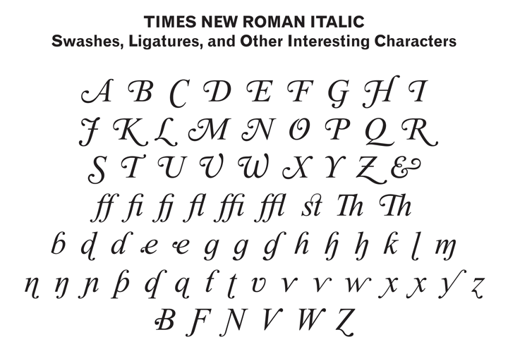
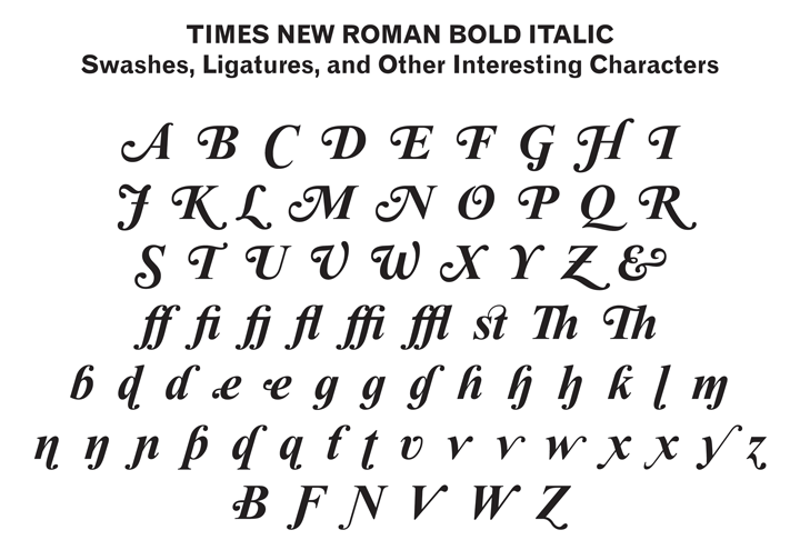
Immediately after this revelation, I typeset “Orange County Rose Society” in Times New Roman Italic, with the swash characters turned on. Wow, it looked amazing! But then I changed the font to Times New Roman Bold Italic, and WOW, stunning! It felt as if the year 1964 had come to life before my very eyes on my computer screen in Adobe Illustrator. I knew then that I had found what I had been looking for! Of course, some of the letterforms needed some tweaking, and that’s where my expertise as a formally-educated, professional graphic designer comes in.

Right away, I loved the swash capitals ‘O’, ‘R’, and ‘S’, but the ‘C’ needed some work. It looked too plain, and it was missing a ball-terminal swash so it could match the other swash capitals. After spending a number of joyous hours in painstakingly adding and blending in the ball-terminal swash onto the bottom terminal of the ‘C’, it felt right. As Times New Roman is considered as a Transitional typeface (a style of serif type that was popular from the mid-18th century until the early-19th century; read about styles of serif types on Wikipedia HERE), a typical swash capital ‘C’ in this style usually has a ball-terminal swash on the bottom terminal, like I had designed. So, at least my modified italic swash ‘C’ is period-correct for a Transitional serif type.
Another ’60s design trend was tight kerning (letter spacing), and since this typographic work would eventually be a logotype, tighter kerning necessitated customization of the ‘ty’ into a ligature.
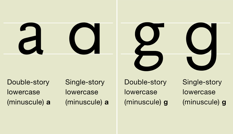
Another character that looked out of place was the double-story lowercase ‘g’. Essentially, what is italicized type? Aside from bringing emphasis to a few words in a long passage of text, it is essentially based on cursive letterforms and handwriting. So, it stands to reason that the italicized letterforms should try to emulate cursive forms as much as possible, and as such, nobody ever writes a cursive ‘g’ as a double-story character. Most people write it as a single-story character. (The same can also be said about the lowercase ‘a’.) The Times New Roman, version 7.00, fonts each have thousands of characters and glyphs; Times New Roman Bold Italic has 2,940 characters and 3,578 glyphs. With that many characters and glyphs, I honestly did not notice the single-story ‘g’ that was included in the font. So, I created my own single-story ‘g’, and I prefer my ‘g’ with its more pronounced ball terminal.
After a few more tweaks to certain details, test prints validated that my proposed OCRS logotype, as a whole, has exceeded my expectations for one designed in the “Heritage 1964” philosophy. I feel it exudes class, elegance, opulence, charisma, and passion with its expressive letterforms and down-to-earth qualities due to its humble beginnings. Each of the three proposed configurations presented here — full logo, seal logo, and logotype — all speak the same language that I have called the “Heritage 1964” design philosophy and concept.

Part I — OCRS monthly magazine
As part of my initial design exercise, I started to ponder about how I would undertake redesigning the OCRS newsletter The Rose Gazette implementing my newly-formulated “Heritage 1964” design philosophy and concept. In late-April 2021, I completed a few initial mockups, and the results were varied. For a dose of inspiration, I looked at some of my automotive magazines from the first half of the 1960s to study typical typographic treatments for publications from this era. I began to notice some stylistic similarities in page layouts and the relationship between typographic, illustrative, and photographic elements. Although the page layouts were almost always laid out in precise grids, these individual elements and their relationship conveyed feelings, depending on the article’s theme, of dynamic action (in articles about racing) and even romantic admiration (in in-depth articles about vehicles and their individual designs in detail).
Post-World War II America saw the maturation of the architectural style known as the International Style. Even in the world of graphic arts, the trend at the time was called the International Typographic Style, also known as the “Swiss Style” because of the notable work by some prominent designers based in Switzerland. The International Style of design, be it architecture or graphic arts, dictated a clear foundation and structure based on squares or rectangles, and the work was always grid-based with a horizontal/vertical stress and 90° angles. The style in graphic arts also dictated flush-left/ragged-right text alignment and added the use of certain sans-serif typefaces that were of the grotesque style (a style of sans-serif type originally designed in the 19th century and into the early-20th century; read about styles of sans-serif types on Wikipedia HERE). However, by the 1960s, deviations from pure International-Style graphic arts included completely justified text alignment and “warming up” the hard, “cold”, grid-based layouts with serif types, as serifs add certain “warmth” to the look and feel of a typographic work. And since legibility studies dating back to the 1950s showed a reader’s preference for serif types over long passages of text, it only seemed logical to compose a “Heritage 1964”-style publication in this manner.
One day, while browsing a favorite typography enthusiast website, I came across an article about the work of the prolific American graphic artist Bradbury Thompson (1911–1984) and how he was commissioned to redesign a number of magazines. Some of his notable work was seen in The Smithsonian magazine beginning in 1969. His work was, and still is, considered to be logical yet beautiful, and his style was a modified International Style. He was known for his subtle use of white space on the page, which is an important aspect that provides balance and allows the reader’s eye to take a psychological break from the inundation of information. Although Mr. Thompson passed away in 1984, The Smithsonian continued to use his layout designs for a number of years, well into the 1990s.
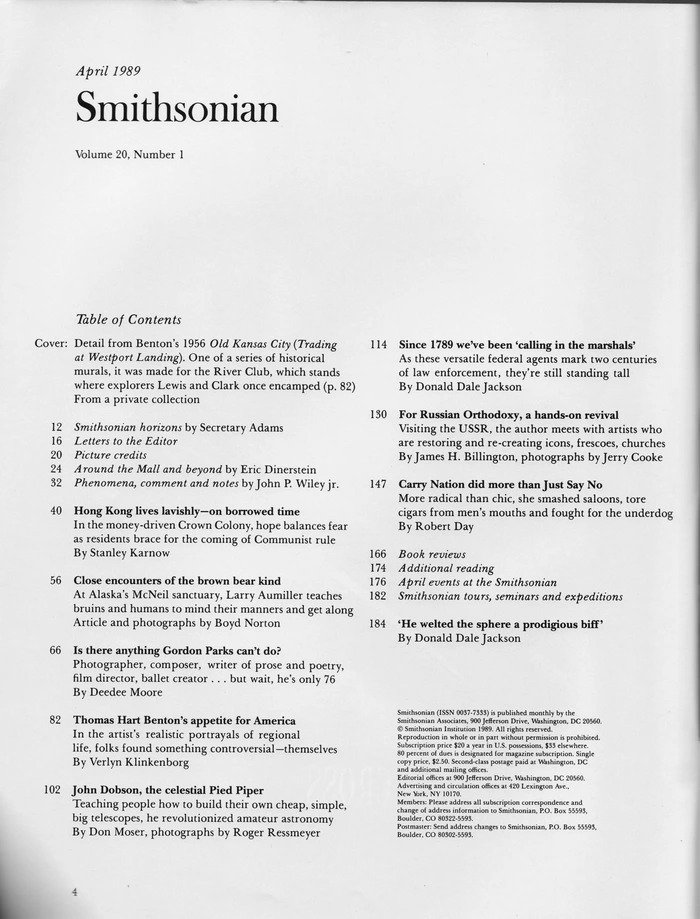
By this April 1989 issue of The Smithsonian, Bradbury Thompson’s design had been in use for 20 years.
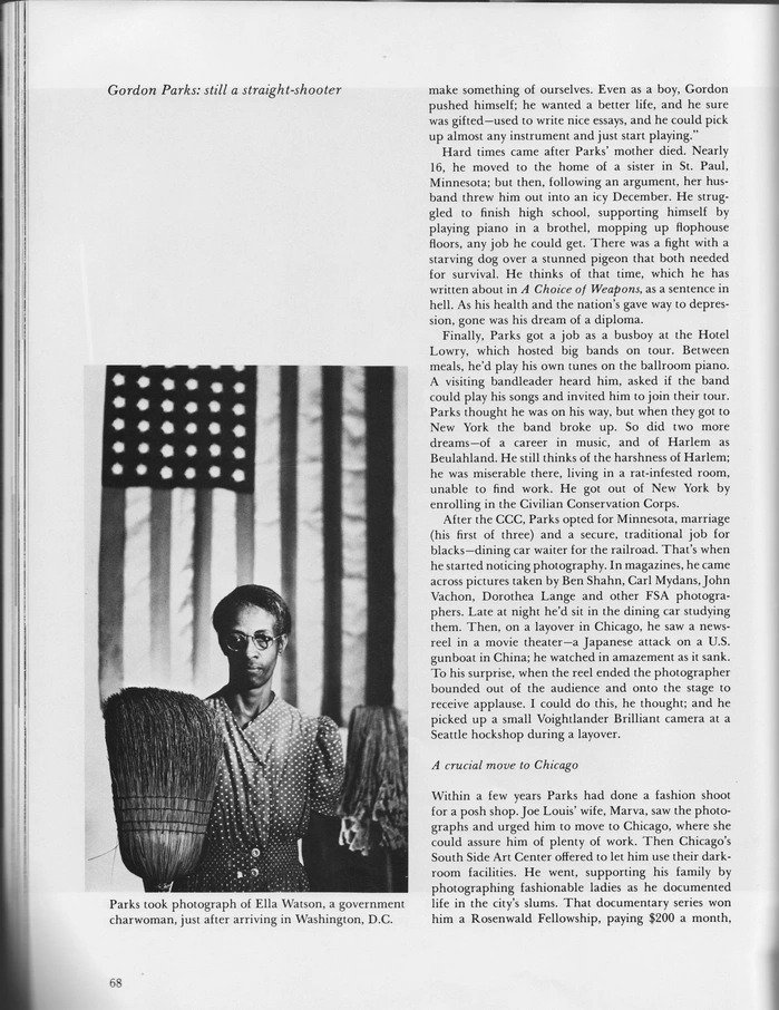
Although Bradbury Thompson had passed away five years before this April 1989 issue of The Smithsonian,
his signature block of white space in the upper-left corner, known as the famous “Thompson corner”, was still in use.
I started to consider the possibility of converting my initial newsletter design into a magazine design. The layout treatments for article text aren’t that much different between the two, but the difference is in how the information is presented. One thing that I feel a typical rose society’s monthly publication lacks is the inclusion of more photos. Here, the subject of roses is a visual one. Authors of articles talk about such-and-such rose, but what does it look like? Yes, a proactive person can simply go online and look it up, but why not include more photos of the roses mentioned in the articles? Plus, photographic elements add visual interest to any given page. So, why would you want to tire out the poor reader by page 3 with so much endless text and a scant few photos, especially if the chosen text typeface is rather unkind to a reader’s eyes?
Then, I realized something else. The current name of the OCRS newsletter, The Rose Gazette, would not work for a magazine. Anything called a “gazette” implies that it is a newspaper, and lo and behold, the definition of gazette is “a journal or newspaper.” (An interesting side note I found: In English- and French-speaking countries, newspaper publishers have applied the name “gazette” since the 17th century.)
And what exactly are the differences between a newspaper (or newsletter) and a magazine? My research has revealed that a newspaper focuses on recent issues and developments in ongoing issues presented in a formal, brief, and objective manner, and a magazine focuses on specific subjects and includes articles, interviews, and current issues with a more informal, pictorial, and subjective presentation. That right there causes me to believe that a rose society’s publication should be more magazine-like. Another difference between the two is their intended audiences: newspapers have a broader audience due to the greater variety in the articles published in one edition, and magazines cater to a more specific audience (e.g., the members of a rose society) that is only interested in a given subject (e.g., cars, fashion, music, gardening, ROSES, etc.). The design of newspapers is simple (i.e., columns of text), while magazines have a more complex design (i.e., creative page layouts) to catch the reader’s eye. The articles in newspapers are generally short, while magazines have longer articles that can extend over several pages. Lastly, newspapers are published more frequently (i.e., daily or weekly), and magazines do not have to be published as frequently (i.e., monthly, bimonthly, quarterly, etc.) due to the types of articles that are composed and contained within. For these reasons, I decided to convert my proposed OCRS publication from a newsletter to a magazine.
In brainstorming about what to call it, dozens of possibilities came up, but I knew the name needed to have “rose” in it somewhere. As I’m also an avid music listener who enjoys almost all genres, upon listening to some classical music one day, the word “opus” came to me. What exactly is an opus? I knew of the musical definition: “a separate composition or set of compositions by a particular composer, usually ordered by date of publication.” But then I found another definition: “any artistic work, especially one on a large scale” (e.g., “He was writing an opus on Native American culture.”) Bingo! That’s exactly what a rose society’s publication is, an opus on the rose hobby, rose culture, and rose exhibition. As a magazine, it’s a subjective, illustrative work on a large scale to cover all aspects of the rose, divided into monthly installments (or issues). Hence the name: The Rose Opus.

Proposed logotype (in black) for The Rose Opus, shown at 720 pixels wide for detail.
I immediately went to work in typesetting my newfound name, The Rose Opus, in the same manner as the Orange County Rose Society logotype. In striving for brand cohesion and identity for OCRS, I felt it was imperative to use the same typeface (Times New Roman Bold Italic with swash characters) so that people can make a visual connection and realize the relationship between the two.
I noticed the font contained a swash ‘Th’ ligature, but I wanted the swash ‘T’ to be more prominent. I also saw that the font contained a few swash ‘h’ characters, and I felt that the one with the ball-terminal swash on top of the ascender felt right. Now I just needed to extend the bottom of the ‘T’ to make it more cursive-like. I felt the same way about the ‘s’ in “Opus”, which essentially has the important job of bringing closure to the whole logotype. After some modification, I believe my final proposed logotype for The Rose Opus also underscores the “Heritage 1964” design philosophy and concept.

The same proposed logotype (in black), scaled down to 360 pixels wide.
Inside The Rose Opus, I knew that I needed to implement the International Typographic Style (or at least a modified version of the style) and my “Heritage 1964” design philosophy and concept. Thus, taking inspiration from Bradbury Thompson’s work in The Smithsonian, the opening spread laid out in a logical manner. My choice of text typeface took more inspiration from Mr. Thompson’s cohesive use of Baskerville types throughout The Smithsonian, and so I decided to echo the look and feel of the OCRS and The Rose Opus logotypes and use various fonts of the Times New Roman typeface family as the main text typeface throughout. But there’s a twist.
This isn’t the same, boring, 12-point Times New Roman that was set as the default font in older versions of Microsoft Word. I took advantage of all those thousands of characters and glyphs in the Times New Roman fonts — things like old-style figures instead of lining figures; proportional figures instead of tabular figures; the use of full f-ligatures; the use of the included, optically-correct small caps; the correct usage of the included, accented characters in certain non-English words; italicized type to provide emphasis; non-English words in italicized type; and swash characters for certain section headings in an article. In other words, the text in The Rose Opus is professionally typeset in 10-point fonts (the typographic standard size for long passages of text in magazines is 8–10 points), and my typographic treatments have made Times New Roman exude the same class, elegance, and sophistication as exhibited in my magazines and brochures from the 1950s and 1960s.
As a nod to the International Typographic Style, my secondary typeface choice used mostly for captions and areas of small text is Bitstream’s Gothic 720, which is the equivalent of Monotype’s Grotesque series of types, which were released between the late-19th century and the first decades of the 20th century. (The Monotype Grotesque types were one of the prescribed typeface choices of the International Typographic Style.) The text of this proposal that you have been reading is set in Gothic 720 Regular, and the italicized type is set in Gothic 720 Italic.
Keeping in line with my “Heritage 1964” design philosophy and concept, all other typefaces used throughout The Rose Opus for decorative purposes (e.g., article headings and subheadings) were commercially available in 1964, and thus, they are period-correct for a magazine published in that year.
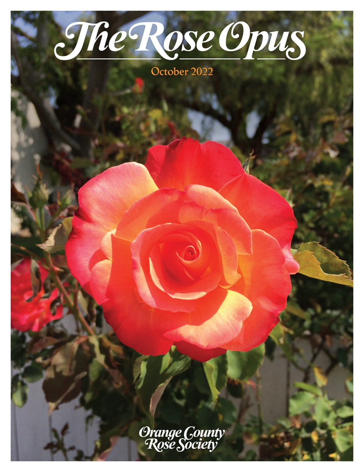
A sample front cover of the proposed The Rose Opus magazine for the Orange County Rose Society,
shown at 720 pixels wide for detail.
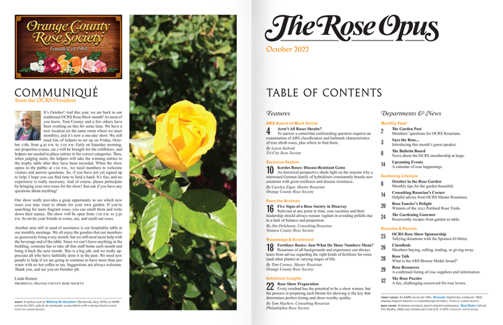
A sample opening spread of the proposed The Rose Opus magazine for the Orange County Rose Society,
with each page scaled down to 360 pixels wide to show the spread’s overall appearance.
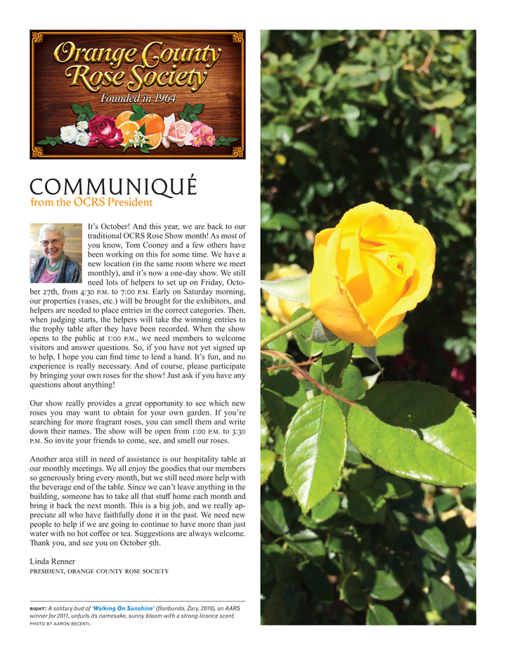
A sample inside-front cover of the proposed The Rose Opus magazine for the Orange County Rose Society,
shown at 720 pixels wide for detail.
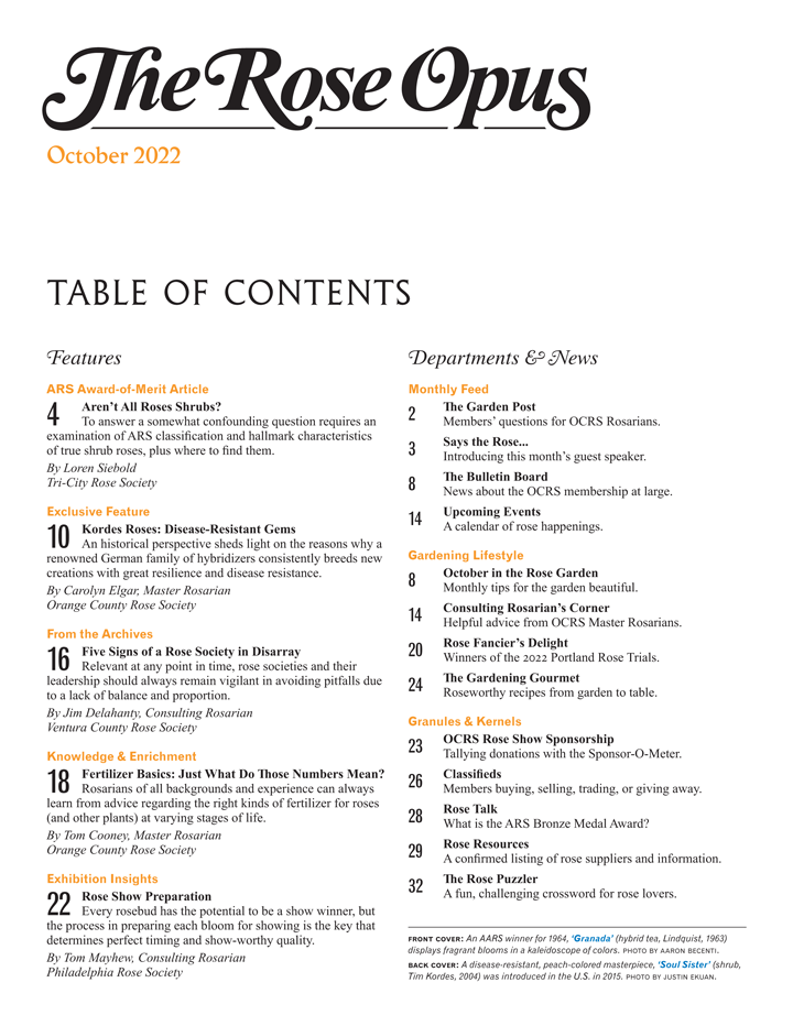
A sample Table of Contents page of the proposed The Rose Opus magazine for the Orange County Rose Society,
shown at 720 pixels wide for detail.

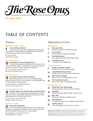
The above comparison shows how closely Bradbury Thompson’s work in The Smithsonian and my work in the proposed The Rose Opus are related.
The two Table of Contents pages have a similar structure, with more color in my proposed page. The same can be said about Mr. Thompson’s typical treatment
of article pages, as compared to my proposed inside-front cover page which displays the proposed OCRS full logo and the president’s monthly message.
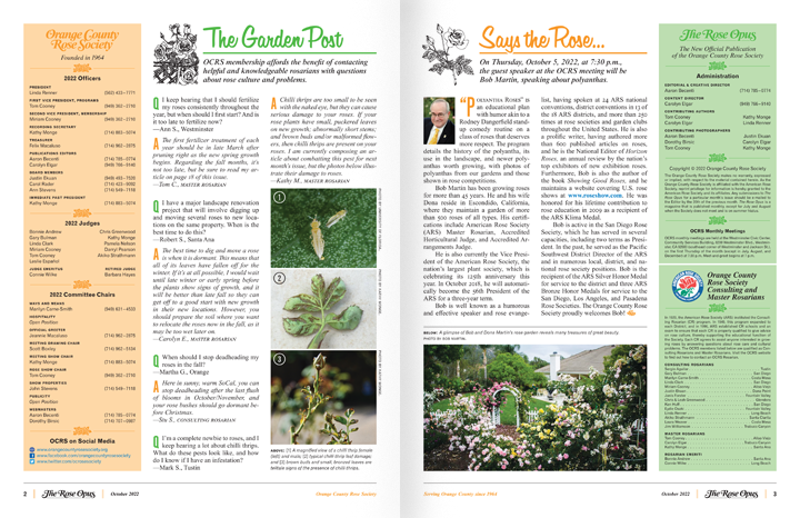
A sample spread showing pages 2–3 of the proposed The Rose Opus magazine for the Orange County Rose Society,
with each page scaled down to 360 pixels wide to show the spread’s overall appearance. On page 2, my proposed “The Garden Post” section
showcases member’s queries to OCRS rosarians about rose problems. On page 3, my proposed “Says the Rose…” section is the article
about the guest speaker at the forthcoming OCRS monthly meeting, which is normally on the cover of The Rose Gazette.
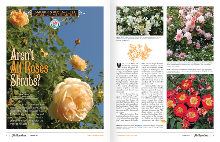
A sample spread showing pages 4–5 of the proposed The Rose Opus magazine for the Orange County Rose Society,
with each page scaled down to 360 pixels wide to show the spread’s overall appearance. For the first article of each issue,
my proposed “ARS Award-of-Merit Article” reprints these types of articles for the benefit of OCRS members.
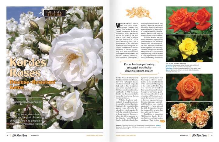
A sample spread showing pages 10–11 of the proposed The Rose Opus magazine for the Orange County Rose Society,
with each page scaled down to 360 pixels wide to show the spread’s overall appearance. The second article of each issue
will showcase my proposed “Exclusive Feature” for a new article written exclusively by an OCRS member or rosarian.
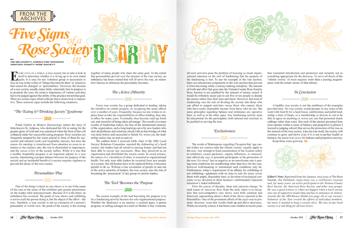
A sample spread showing pages 16–17 of the proposed The Rose Opus magazine for the Orange County Rose Society,
with each page scaled down to 360 pixels wide to show the spread’s overall appearance. My proposed “From the Archives” showcases
relevant articles from past installments of The Rose Gazette which continue to address issues of the present day.

A sample spread showing pages 18–19 of the proposed The Rose Opus magazine for the Orange County Rose Society,
with each page scaled down to 360 pixels wide to show the spread’s overall appearance. Another feature is my proposed “Knowledge & Enrichment”
which showcases articles about some aspect of rose culture and addresses relevant, ongoing problems regarding that aspect.
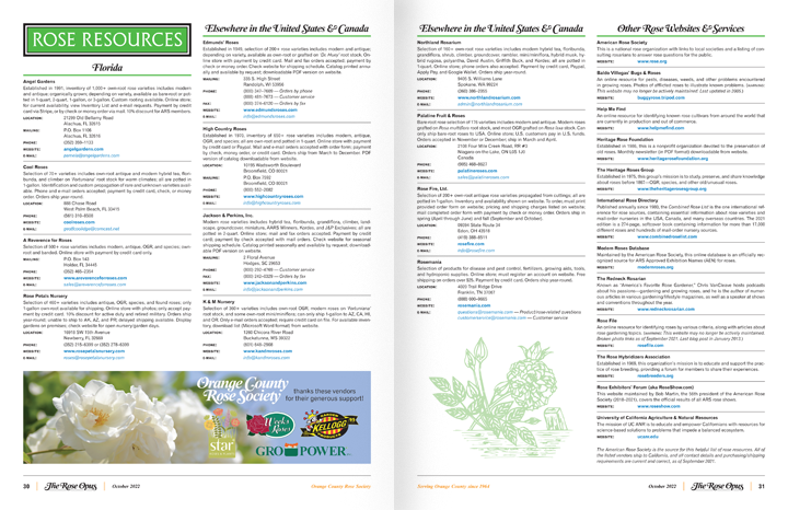
A sample spread showing pages 30–31 of the proposed The Rose Opus magazine for the Orange County Rose Society,
with each page scaled down to 360 pixels wide to show the spread’s overall appearance. Another feature is my proposed “Rose Resources”
which showcases three pages of currently confirmed rose vendors and services. It is the same listing in current issues of The Rose Gazette,
but without the typos and misinformation (e.g., outdated product offerings, contact information, purchase/payment methods, etc.).
What I have presented above is only a sampling of the ideas inside my proposed mockup of The Rose Opus. There are 32 interior pages in the proposed magazine (36 pages in total, if you count the front and back covers). There are other features and sections that I did not showcase above, but everything is inside the PDF of my proposed mockup. Also, my proposed magazine allows for the inclusion of advertisements from sponsors and vendors who want to support OCRS. With a beautiful, professionally-designed publication like The Rose Opus to speak volumes about the integrity of the society, sponsors will want to advertise in our high-quality magazine.
Feel free to peruse the provided 3D flipbook of the PDF at your leisure. I designed The Rose Opus with layouts that have printer-friendly margins. There are no bleeds (the term for printing that goes to the edge of the paper). And this magazine was designed for print (meaning, it can be professionally printed) while being completely optimized for web viewing with functioning bookmarks (even the Table of Contents page is interactive) and hyperlinks (which appear blue in the text).
Lastly, a small warning. Due to the photographic qualities of The Rose Opus, the 3D flipbook may lag a bit. The PDF is 50MB in size. So, in case you wish to download the file, you have been warned about its large size!
I’m sure you noticed all the other typographic gems inside The Rose Opus. My proposed “The Gardening Gourmet” feature utilizes another custom logotype done in the same style as the OCRS and The Rose Opus logotypes. Here again, the swash capital ‘G’ included in the font proved to be a bit inadequate. So, I designed a longer, ball-terminal, swash tail, and I feel it has the same amount of panache as the other logotypes. I also customized the ‘m’ with its descending swash terminal and the ‘t’ with its ending calligraphic flourish.
Another typographic treat can be found on page 22. As a respectful nod to Bradbury Thompson, the typeface used to set “Rose Show Preparation” — called Thompson Baskervale Regular — was one of his custom-designed types, and it was released by Photo-Lettering, Inc., in 1960. (I also have Thompson Baskervale Light in my extensive font collection, which looks its very best in headlines set at very large point sizes.)

Part II — OCRS rose show program
Upon rejoining the Orange County Rose Society in September 2021, I heard about the society’s upcoming rose show in late-October, and as of this writing, I am both excited and proud that OCRS will have this year’s rose show at the Richard Nixon Presidential Library & Museum in Yorba Linda, California. A fact often overlooked is that Orange County is home to the birthplace of a 20th-century U.S. President. Regardless of whether or not you agreed with his politics and the events of his presidency, it will always be just plain cool to host a rose show on the grounds of a presidential library. This is one thing that not very many cities or counties can claim, and I applaud OCRS for promoting another great part of Orange County’s history.
With all this excitement and pride, I was fully expecting whatever printed materials for this show to visually communicate this milestone. Upon receiving a copy of the show program, I was disappointed that the society’s pride was conveyed through clip-art imagery on the front cover and numerous typos and mistakes inside. Again, going back to what I had said earlier in this proposal: anything that communicates Orange County pride should be of a high standard. We are home to multi-million-dollar properties, beautiful beaches, and year-round sunshine! And aside from all that, Orange County has a rich history dating back to a time before orange groves, back to the 19th century when Spanish landowners maintained acres of ranchland.
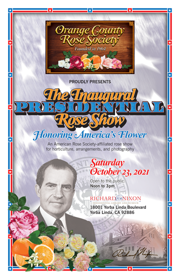
Thus, I took it upon myself to design a rose show program utilizing my newly-formulated “Heritage 1964” design philosophy and concept. Of course, I realize that Mr. Nixon was President from 1969 to 1974, but his 1968 campaign materials were designed in typical ’60s fashion, implementing a great deal of International Typographic Style in his campaign banners, buttons, signs, and everything else. I knew that the name of the rose show needed to be prominent and well-designed. I wanted to mix something that felt “presidential” with the “Heritage 1964” style. In looking through my vast font collection, I came across the actual typefaces that are used on our nation’s currency. After playing around with various configurations, I feel that the proposed rose show logotype below communicates Presidential pride in my prescribed “Heritage 1964” style.

Proposed rose show logotype (in full color), shown at 720 pixels wide for detail.
The front-cover imagery needed to convey a presidential feeling and promote pride for one of Orange County’s sons who did his best to serve this country as the U.S. President during a most difficult time for our nation. So, of course I started with the American flag for patriotism, but then I wanted it to recede to the background, which was achieved by ghosting it with numerous filters and effects. I also needed to add the Presidential seal in the background as well. I blended in a photo of Nixon’s birthplace home and added one of his best signatures. I placed one of his best portraits and left a choice for full color or “ghosted” black-and-white. I designed the patriotic border from scratch with individual elements. I imported the same oranges from the OCRS full logo (to bring cohesion and identity) and drew the roses, which are different from the ones in the OCRS logo. Much like The Rose Opus magazine, all work was composed in Adobe Illustrator, Photoshop, and InDesign.
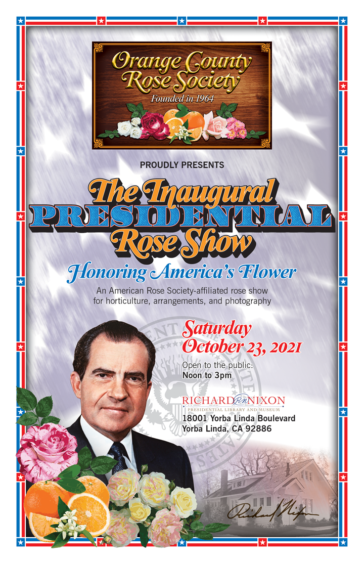
Proposed rose show program cover (with President Nixon in full color), shown at 720 pixels wide for detail.

Proposed rose show program cover (with President Nixon in grayscale), shown at 720 pixels wide for detail.
The above comparison shows how the composition differs with President Nixon in either full color or grayscale.
Inside the program, I used the same currency typeface and scrolls for the section headings, and the main text typeface used throughout is another International Style-prescribed type, News Gothic. I chose this typeface because of its patriotic roots as an American innovation that was designed by the prolific American type designer Morris Fuller Benton and released by American Typefounders as early as 1908, with various styles added to the News Gothic family through the early-1960s. I’ve always loved News Gothic’s legibility at small point sizes, and it works beautifully in this rose show program. Times New Roman plays a secondary role in a larger point size, with its beautiful Bold Italic swashes for the class sections, and Times New Roman’s use brings further cohesion to the branding of this rose show as one by the Orange County Rose Society.
Also, be sure to check out the maps on page 14, which I drew to scale to show the location of our monthly meetings. I’ve been intrigued with looking at various maps since a very young age, and I’ve been drawing maps in Illustrator for decades now. So, it’s only natural that I consider myself an expert at drawing maps.
Feel free to peruse the PDFs of my proposed rose show program at your leisure. As with The Rose Opus, I designed the rose show program with printer-friendly margins. There are no bleeds (the term for printing that goes to the edge of the paper). The 3D flipbooks utilize web-optimized PDFs with functioning bookmarks to each section. If you wish to print these PDFs, please click on the provided links below the 3D flipbooks to download the printable PDFs.
Links to download the printable PDF versions of the above proposed OCRS rose show program:
DISCLAIMER: These printable PDFs are DRAFT VERSIONS. Assuming that all other information is current and correct, there are still 2 pieces of information missing — the award for Class 12 (page 4); the award for Class 38 (page 8).
Draft #1 — President Nixon in full color:
Click HERE.
Draft #2 — President Nixon in grayscale:
Click HERE.

Conclusion
I hope you have enjoyed reading what I had to say and viewing what I had to share. As with any project, I take great pride and care in the work I do. Even for myself, it has been interesting to recount my entire design process, which first started seven months ago as an exercise in formulation and design. As you can see, the project took on a life of its own, and it grew into a whole design philosophy that is completely functional and concept-driven. As with all of my clients, I only have the Orange County Rose Society’s best interests in mind.
If you like what you have seen, feel free to contact me at mystichromecobra2004@gmail.com anytime.
I realize that the Orange County Rose Society is interested in attracting both new and younger members, and I have some ideas that are part of a much larger marketing plan. Formulating such plans are one of my expertise, and it’s part of what I’ve been successfully doing for clients for years. So, just imagine what I could do for the OCRS on its website and online presence with branding and identity firmly based on my “Heritage 1964” design philosophy.
New members are always within reach. One only needs to formulate how to appeal to them.
— Aaron Becenti, posted on October 4, 2021
